

The new concept of a master brand for Ashland University has surfaced. Director of Marketing and Communications, Karen Martin said, “The goal of the master brand project is to clearly identify what Ashland University is all about in ways that resonate particularly with prospective students and to differentiate ourselves from other universities.” The goal is for prospective students to understand why they would choose Ashland University instead of any other potential university.
Vice President for Enrollment Management and Marketing, Keith Ramsdell said, “We look back at our history, we look current at who we are today, and we determine what differentiates us from everyone else. We use those guiding lights to determine where we are headed.”
The university is trying to represent its brand as clearly as possible through color palettes, typefaces, and photo treatments—the so-called building blocks of the university. The idea is to represent the AU experience in the best way possible.
The university is working with Vinyl Marketing, who are donating all of their time for this project. Vinyl Marketing researched the history of Ashland University and the competitive universities in Ohio. They found that most of the mottos of the other universities are about the university themselves and not the students.
The university will keep the messaging themes used throughout campus: “Accent on the individual” and “teach you how to think, not what to think.” Ramsdell explained that the messaging themes will not go away. The goal is to build “…something that is ‘carved into the granite,'” said Ramsdell. The messaging themes help to identify who the university is but are not necessarily the differentiator that they are trying to build. They are trying to identify a master brand to which the messaging themes will point.
The motto will not end up on brochures or billboards but will be a short, compelling, and inspirational message that captures the essence of Ashland University. According to Martin, a motto should be: “aspirational, authentic, very short, multifaceted, timeless, and substantial.”
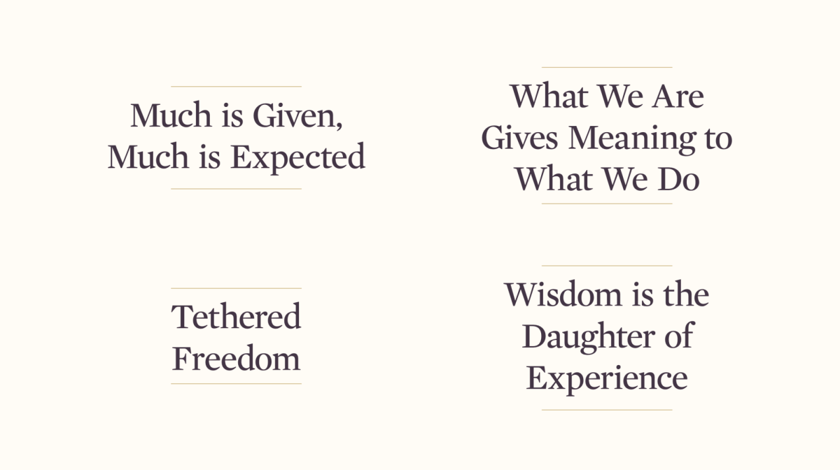
There are four concepts for the new motto. The first is “Much is Given, Much is Expected”. It is based on scripture and communicates several aspects of the university. The university, the students, the faculty, the donors, and the alumni are expected to benefit the community. Concept two is, “What We Are Gives Meaning to What We Do”. This is a historical quote from an Ashland College president from the early 1900s. Students not only learn in the classroom but build character as well. The third motto is “Tethered Freedom, ” which refers to pursuing truth rather than any specific doctrine or methodology. The last concept is “Wisdom is the daughter of Experience”. This quote from Leonardo Da Vinci represents the idea of testing knowledge with actual experience. The team is getting feedback on each motto from students, staff, faculty, and alumni.
The idea of visual identity also focuses on the colors, typefaces, and photo treatments. Vinyl Marketing did a ton of digging in the archives and found different eras of the universities’ identities. There has been a lack of consistency in different areas around the university, which dilutes what people recognize as Ashland University. There are two different visual directions the team has been getting feedback on. The first has a dark purple and gold palette. There is a recommendation for the AU word mark with a thinner type. The seal’s artwork will be neater and more defined. The second concept has a mid-tone, which is a bit brighter. The wordmark has a more significant change, with a different typeface. “The artwork is also neater but used with the new colors for this direction” said Martin.
“Nothing is set in stone. We are nearing the end of the process of gathering feedback from the constituents,” said Martin. The constituents are asked to fill out feedback sheets to select which option they feel represents the university the best. They are also asked to suggest why or why not the concepts reflect Ashland University well.
The process of the master branding is an ongoing project and is hoped to be implemented by 2024. There has been about a year of work on the project.
This is a developing story.

pbaldrich • Nov 29, 2023 at 5:53 am
Worst branding ideas since “new coke”