AU’s website redesign is constantly updating
Marketing and Communications continues to roll out updates
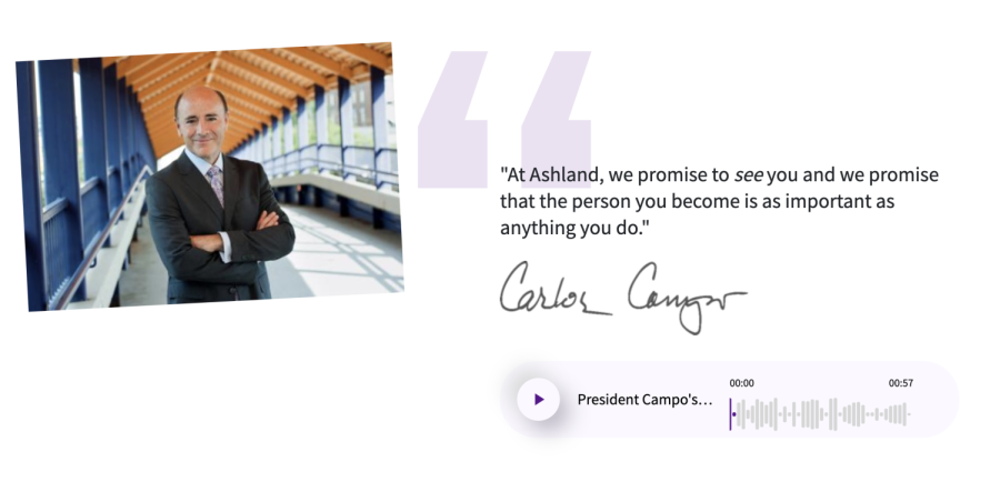
The new and improved website showcases quotes and live recordings from figures on campus.
Ashland University’s Marketing and Communications launched the new redesign for the ten-year old ashland.edu with an “incomplete disclaimer.”
According to AU President Dr. Carlos Campo, the website redesign has “been in the works for quite some time.” He stated that the website was anticipated to launch over the summer, but was delayed due to labor shortages.
“It has been a year-long project,” Karen Martin, director of Marketing and Communications, added. “We had some delays and shortages and we had a staff member leave, so we supplemented with freelancers, but couldn’t fill open positions.”
Martin said that the “incomplete” launch was a priority at the time, since the website’s primary purpose was for student recruitment including admissions, financial aid and student affairs.
“It is a continuous work-in-progress,” she continued. “A major redesign requires constant maintenance, making sure content is accurate. We knew that not all pages were complete, but it is not necessarily an issue with the technical migration, as we have the equivalent of two people working on this site.”
According to Keith Ramdsell, vice president for Enrollment Management and Marketing, the project’s early launch decision came with a commitment to the Executive Leadership Team (ELT).
“The goal was to have links addressed within about 10-14 days [after launch],” Ramdsell said. “With academic and other critical pages live and a few more pages left to complete, I want to give credit to the development, building and writing processes.”
The weekend after the initial launch, Ramsdell stated that 26 pages went live.
“We went from a bloated, ten year old site with 1,000 pages, to a cleaned-up site with about 100 pages,” he continued. “[It] is remarkable to have these few issues.”
Martin explained that the university partnered with Image-X, an encryption team, which helped with different concepts.
As far as the design concept goes, Martin said Marketing settled on the “We See You” concept for the new website’s main page.
“The ‘We See You’ concept was the one that kind of identified the ‘Accent on the Individual’ and really reflected that theme,” Martin added.
On the technical side of the site, the previous site was not designed for mobile, according to the university’s Website Manager Chad Draper.
“We wanted to make it more mobile-friendly,” Draper said. “We will not have headaches in future updates. With the version it is now until later, it should be simple fixes.”
Ramsdell emphasized that there is still work to be done, but the team is working through with diligence as quickly as possible.


